

Common Dashboard Mistakes That Are Quietly Costing Indian CFOs Money
By BiPivot Team · 7 September 2026
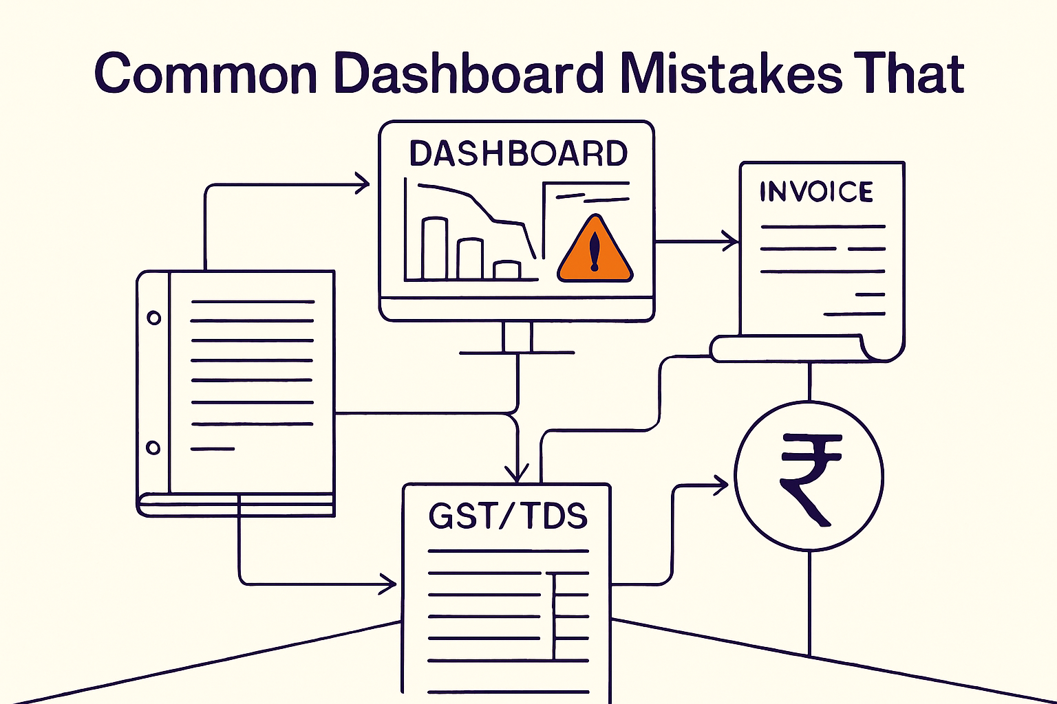
Most Power BI dashboards in mid-sized Indian companies are not broken because of bad software. They are broken because they were built to show data instead of support a decision. That single confusion — display versus decision — is the root of nearly every dashboard mistake we see in finance teams across Pune, Ahmedabad, Coimbatore and Gurugram. Dashboards frequently fail to drive decisions because they are built to show data rather than to support specific, actionable outcomes (SAP BW Consulting).
This matters more in India than most global dashboard guides admit. Your dashboard isn't just competing for attention against a busy CFO's calendar — it's operating inside a regulatory environment where a missed ITC reconciliation costs 24% annual interest, and a delayed cash-flow signal means a working capital crunch nobody saw coming. Let's walk through the mistakes that actually hurt, and what to do instead.
Why Do Finance Dashboards Fail to Change Decisions?
The pattern is consistent: a dashboard gets commissioned after someone says "we need better visibility," a BI analyst pulls together every metric the ERP can export, and six weeks later the finance head has a beautiful screen full of numbers nobody acts on.
The fix starts before Power BI opens. Ask three questions for every dashboard:
- What decision does this screen need to enable? ("Should we release this dealer's credit hold?" not "show sales.")
- Who makes that decision, and how often? A daily collections call needs different data density than a monthly board pack.
- What action follows a red flag? If there's no defined next step, the metric shouldn't be on the dashboard.
Many Power BI reporting errors trace back to skipping this exercise — teams start dragging fields into a canvas before anyone has written down the business question the report is meant to answer. We've covered the discipline of translating business questions into report structure in more depth in our ERP reporting playbook for mid-sized Indian companies; the short version here is that a dashboard without a stated decision is a very expensive PDF.
Is Your Dashboard Too Crowded to Be Useful?

Walk into almost any mid-sized manufacturing or FMCG finance office and you'll find a dashboard with 18-22 visuals crammed onto one screen: revenue by region, expense by category, a gauge for cash, three pie charts, a table of top 50 SKUs, and a trend line squeezed into a corner too small to read. This is the single most common design mistake, and it's measurably costing productivity — 35% of customer experience professionals report spending excessive time navigating dashboards overloaded with information, leading to fatigue and lower productivity (Crystal CG), and the same fatigue shows up in finance teams staring at MIS packs.
A practical fix used in our client engagements: the 5-second rule. If a first-time viewer can't identify the single most important number on the page within five seconds, the dashboard has failed. Apply this test:
- Page 1 — Decision page: 4-6 KPIs maximum (e.g., cash runway, DSO, GST ITC blocked amount, gross margin %).
- Page 2 — Diagnostic page: breakdowns by region/product/customer for the metrics that flagged a problem on page 1.
- Page 3 — Detail page: transaction-level drill-through for the finance team, not for the CFO.
One Ahmedabad-based textile exporter we worked with cut their board MIS from 26 visuals across one page to 5 KPIs plus drill-throughs. Review time in the monthly board meeting dropped from 40 minutes of scrolling to 8 minutes of discussion — because the numbers that mattered were no longer buried between a pie chart of stationery expenses and a donut chart of employee headcount by department.
Are You Using the Wrong Chart for the Wrong Financial Story?
Chart selection is where technically competent Power BI developers still go wrong. The choice of inappropriate visual types for financial comparisons can obscure the exact insight you're trying to surface — the classic offender being pie charts used for too many categories, where 12 wedges of similar size tell you nothing.
Quick reference for Indian finance dashboards:
| Financial Story | Right Chart | Wrong Chart |
|---|---|---|
| GST liability trend over 12 months | Line chart | Pie chart |
| ITC eligible vs. ineligible vs. blocked | Stacked bar | 3D pie chart |
| Distributor-wise outstanding (50+ distributors) | Sorted horizontal bar with top 10 + "others" | Pie chart |
| Budget vs. actual by cost center | Variance bar (bullet chart) | Line chart |
| Working capital days (DSO, DPO, DIO) | KPI cards with trend sparkline | Table of raw numbers |
| TDS deducted vs. deposited by section | Matrix with conditional formatting | Stacked column |
The rule of thumb we give finance teams: if you need more than 6 wedges in a pie chart, you need a bar chart. If you're plotting more than 8 lines, you need a small-multiples view or a filterable table, not a spaghetti chart.
Why Do Dashboards Show Numbers Without Telling You If They're Good or Bad?
A dashboard that reports "Gross Margin: 22%" without a target, prior-period comparison, or industry benchmark is not informative — it's just an audit trail. Dashboards often lack the context or narrative needed to interpret whether a metric represents good or bad performance without a visible benchmark or trend line.
This is especially costly in India's low financial-literacy environment. Only 24% of the Indian population is financially literate, well below the global average of 42%, and digital financial literacy among millennials sits at just 19% (NCAER). Even more starkly, only 27% of Indian adults are considered financially literate versus 52% across advanced economies (World Economic Forum). If your dashboard's audience includes regional sales managers, plant heads, or family-business promoters without formal finance training, raw numbers without context will be misread or ignored entirely.
Fix: every KPI card needs three elements minimum — the number, the comparison (last month, same month last year, or budget), and a color-coded status (green/amber/red against a pre-agreed threshold). "Collections: ₹4.2 Cr" tells a viewer nothing. "Collections: ₹4.2 Cr (vs. ₹5.1 Cr target — 82% achieved, red)" tells them exactly what to ask about in the next call.
Are You Building Dashboards for Yourself Instead of the Actual Audience?
Ignoring the specific needs and roles of the target audience — for example, building an overly detailed transaction-level dashboard for executives who need a one-page summary — is one of the fastest ways to kill dashboard adoption. We've seen finance teams proudly present a 15-tab Power BI workbook to a promoter who wanted three numbers: cash in bank, overdue receivables, and this month's profit.
Match the dashboard to the role:
- Promoter/Board: 5 KPIs, monthly cadence, strategic framing (cash runway, EBITDA trend, compliance exposure).
- CFO/Finance Head: 15-20 KPIs, weekly cadence, working capital and margin drill-downs.
- Controller/Accounts Manager: transaction-level detail, daily cadence, exception-based alerts (overdue invoices, unmatched GSTR-2B entries).
- Regional Sales/Plant Head: operational KPIs relevant to their P&L slice only — not company-wide numbers they can't influence.
If you're in pharma or another regulated manufacturing sector, audience segmentation gets even more layered because compliance stakeholders (QA, regulatory affairs) need visibility too — we go deeper into that stakeholder mapping in our pharma dashboard blueprint.
Is Bad Data Quietly Destroying Trust in Your Dashboard?
Using inaccurate, incomplete, or outdated financial data renders even the best-designed dashboard unreliable, and it's more common than most finance leaders admit — teams frequently start building reports before adequately cleaning and validating the underlying data, which produces inconsistencies and generates significant rework hours later.
The financial cost of this is not abstract. Poor data quality costs organizations an average of $12.9 million annually (Velosio), and within financial institutions specifically, the average annual cost climbs to $15 million (Atlan). For a mid-sized Indian company, the equivalent damage shows up as duplicate vendor payments, missed TDS deductions caught only during a tax audit, and GST returns filed on numbers that don't reconcile with books three months later.
A concrete Indian example: a Coimbatore-based auto-components supplier had a dashboard showing "ITC available: ₹18.4 lakh" pulled directly from purchase register entries — but not reconciled against GSTR-2B. Of that ₹18.4 lakh, ₹3.1 lakh was never reflected in the supplier's GSTR-1 filings, making it ineligible. The finance team had already adjusted this against output liability. Correcting it after the fact meant reversing the ITC and paying 24% annual interest on the shortfall for the period it was wrongly utilized — roughly ₹9,300 for a 45-day gap on that ₹3.1 lakh alone. Multiply that pattern across a full financial year of vendor mismatches and the number stops being trivial. Accurate ITC reconciliation is a genuine profitability KPI in Indian SMBs, not a compliance footnote, precisely because ineligible ITC and the resulting 24% interest hit EBITDA directly. Our detailed breakdown of automating this reconciliation is in Invoice Matching Automation: A CFO's Guide to Protecting ITC and Cash Flow, and the underlying error patterns are catalogued in Common GST Errors AI Can Detect Before They Cost You ITC.
Why Does Excel Dependency Make Dashboard Mistakes Worse?
Here's where mid-sized Indian companies diverge from the generic "dashboard best practices" articles written for US and European audiences. Many CFOs here still run month-end MIS off Excel, stitched together manually from Tally exports, bank statements, and departmental spreadsheets. That data is often 15-25 days old by the time it reaches decision-makers, forcing reactive rather than proactive decisions.
The dashboard mistakes compound this problem instead of fixing it. A Power BI dashboard connected to a stale, manually-refreshed Excel extract is not an upgrade — it's a prettier version of the same 20-day-old data, with the added risk that stakeholders now trust it more because it looks more sophisticated.
We've seen finance teams spend three weeks building a visually polished Power BI report on top of a spreadsheet process that still requires someone to manually copy-paste GST return data every month. The visualization layer improved; the underlying decision latency didn't move at all.
The real fix is connecting Power BI directly to live sources — Tally, your ERP, and GST portal exports — rather than to a manually maintained Excel intermediary. Chartered Accountants in India who make this shift report saving 60-80% of MIS preparation time by moving from spreadsheets to auto-refreshing dashboards (FireAI). That's not a productivity nicety — it's the difference between finding out about a cash shortfall on the 25th of the month versus the 3rd.
Why Is a Single Source of Truth So Hard — and So Necessary — in Indian Finance Teams?
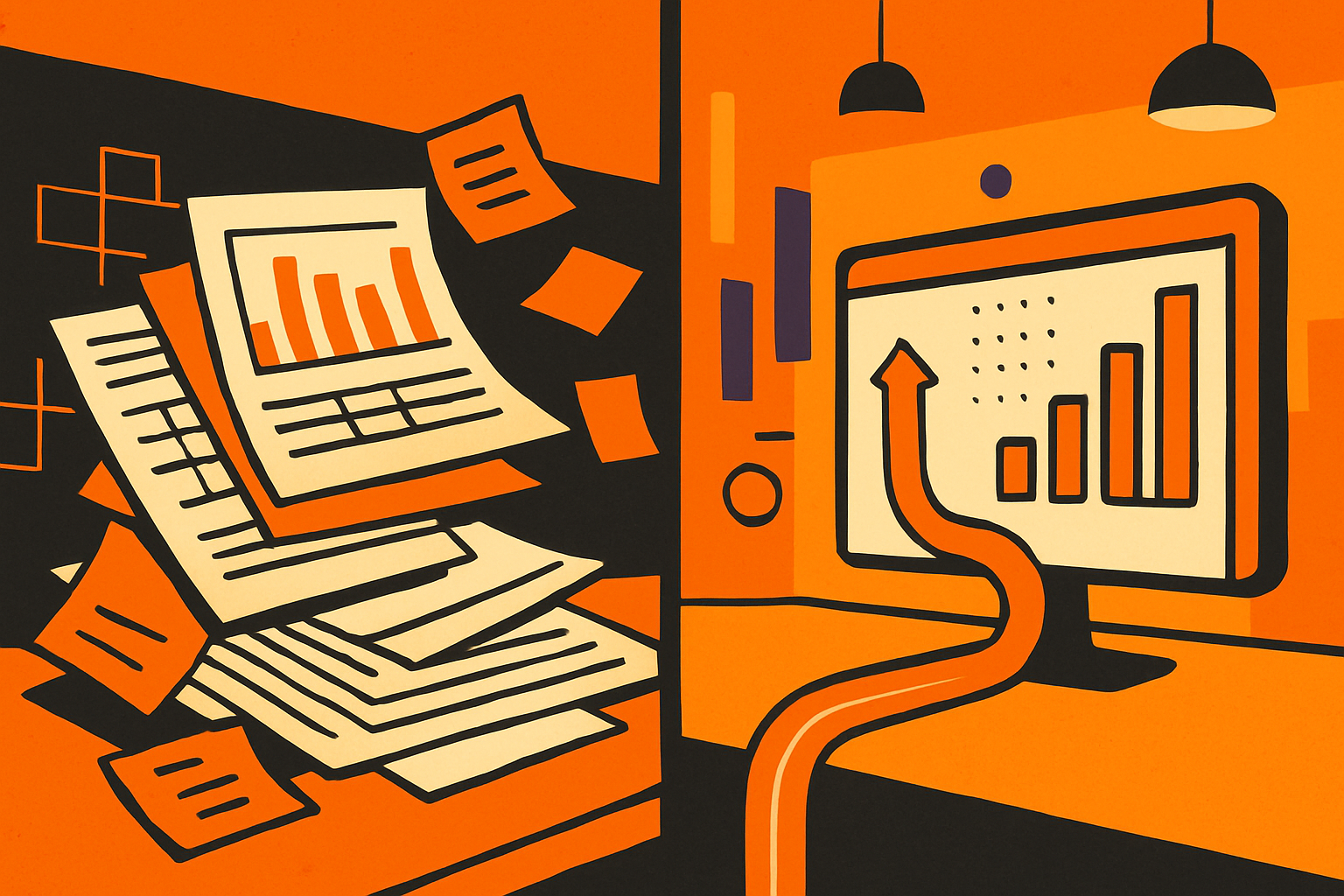
Mid-sized Indian companies rarely run one clean system. It's common to have Tally for accounting, a separate CRM for sales, a homegrown Excel tool for distributor claims, and an HR payroll system that doesn't talk to any of them. Establishing a genuine Single Source of Truth (SSOT) is essential to consolidate this fragmented data and ensure consistent reporting — but it's also the step most dashboard projects skip because it's less visible than the final chart.
Without an SSOT, we routinely see three versions of "revenue" circulating in the same company: the CRM's booked-order number, Tally's invoiced revenue, and the sales team's own Excel tracker — each slightly different, each defended by a different department in the monthly review. The dashboard mistake here isn't a chart choice; it's building visualization on top of unreconciled data pipes and hoping the pretty screen resolves the disagreement. It won't. If your ERP reporting itself has structural gaps feeding this fragmentation, that's worth fixing first — see our ERP reporting best practices guide for the reconciliation steps that need to happen before dashboard design even begins.
The organizations that get this right see it in their growth numbers: top-quartile companies experience more than 50% higher revenue growth by automating processes and enabling swift decisions through trusted, easily accessible data (Crystal CG). Conversely, organizations that roll out dashboarding technology without proper strategic alignment to a single trusted dataset risk up to 9% value erosion from the investment (Crystal CG).
How Do You Design a Dashboard That Indian CFOs Will Actually Use?
Pull the fixes together into a working checklist you can run against your current Power BI reports this week:
- Write the decision first. Before opening Power BI, write one sentence: "This dashboard helps [role] decide [action] by [date/frequency]." If you can't complete that sentence, don't build the page yet.
- Cap the top page at 6 KPIs. Everything else goes on a drill-through page.
- Match chart type to comparison type. Trend = line. Composition (≤6 categories) = pie or donut. Comparison across many categories = sorted bar.
- Add context to every number. Target, prior period, and a color status — no bare figures.
- Segment by role. Board, CFO, controller, and operational manager each get a version scoped to their decisions, not a shared one-size-fits-all screen.
- Reconcile before you visualize. Validate GSTR-2B against your purchase register, confirm TDS deducted matches TDS deposited (Form 26Q), and check MCA filing due dates are pulling from the actual compliance calendar — not a static list someone updated in April.
- Connect live, not manual. If a human is copy-pasting data into the source file monthly, your "real-time" dashboard is neither real-time nor reliable.
- Test the 5-second rule with someone outside the finance team before rollout.
If you're deciding what tooling to use to accelerate parts of this process — drafting KPI definitions, writing DAX, or documenting SOPs around the refresh cadence — our comparison of ChatGPT vs Claude for finance teams is a useful starting point, and pairing dashboard design with documented processes is covered in How to Build SOPs That Employees Actually Follow — a dashboard without an SOP behind its data refresh tends to drift back into the same mistakes within two quarters.
How BiPivot Helps
BiPivot works with finance teams at mid-sized Indian companies to redesign Power BI dashboards around actual decisions — not just prettier charts — while reconciling the underlying GST, TDS, and ERP data so the numbers can be trusted the first time. If your current dashboards are generating more scrolling than action, talk to us about a working-capital-focused rebuild that your board will actually read in eight minutes instead of forty.